Project
OverView
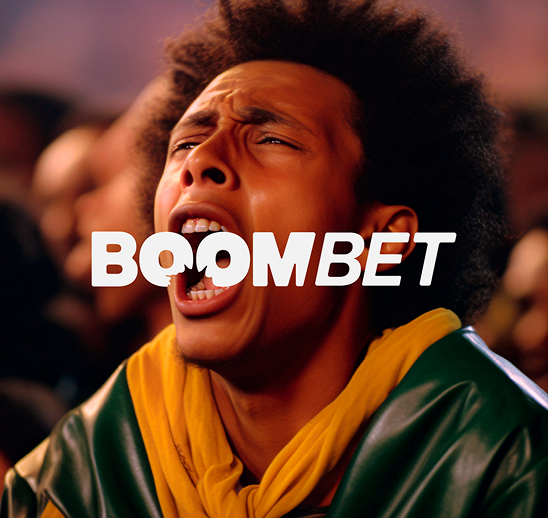
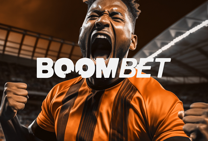
CREATING A STRONG, MODERN IDENTITY THAT CAPTURES THE ENERGY OF THE BOOMBET BRAND.
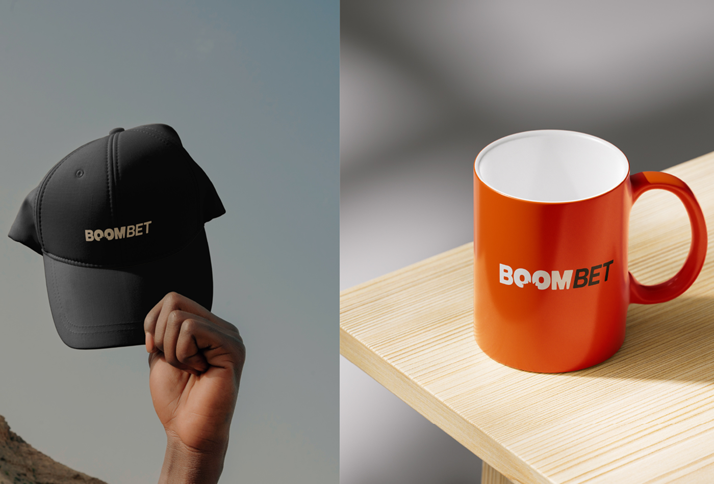
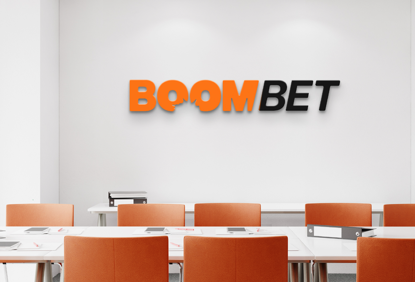
We developed a bold logotype built on clean geometric forms and balanced proportions, paired with a striking color palette that conveys exitement and confidence. The custom typography was crafted to feel contemporary and approachable, while the use of vibrant orange delivers instant recognition and high visual impact.
The design goal was to create a bold and distinctive visual identity that embodies the energy, pride and diversity of West Africa. Our creative team develope a unique typeface logo inspired by African handwritten scripts, cultural patterns, and festive motifs, ensuring the brand is instantly recognizable across signage, merchandise, digital platforms, and vent spaces.
PROBLEMS
WE FACED
BUILDING A BRAND IDENTITY THAT BALANCES ENERGY, MODERNITY, AND TRUST.
BoomBet needed a fresh visual identity that would stand out in a crowded entertainment market while building credibility with its audience. The challenge was to capture the high-energy spirit of the brand without losing a sense of professionalism and trustworthiness, ensuring it appealed to both new and existing customers.
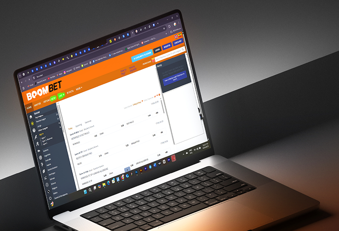
The design also had to be versatile and scalable, working seamlessly across a variety of applications — from small digital icons to large-scale event signage — while maintaining clarity, impact, and a consistent brand voice.
OUR
SOLUTION
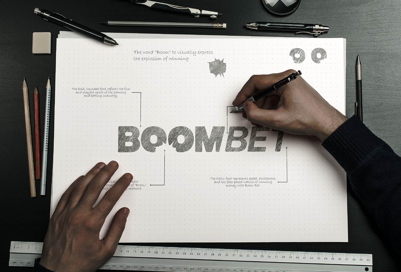
DEFINING A DISTINCTIVE VISUAL IDENTITY THAT EMBODIES BOOMBET’S ENERGY AND CONFIDENCE.
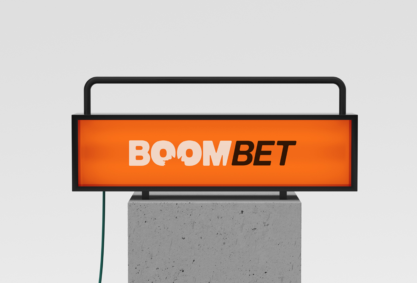
Our creative team developed a bold, custom logotype using clean geometric forms paired with a striking orange and black color palette. The typography was carefully crafted to feel modern and approachable, while the energetic color scheme ensures immediate recognition and impact.
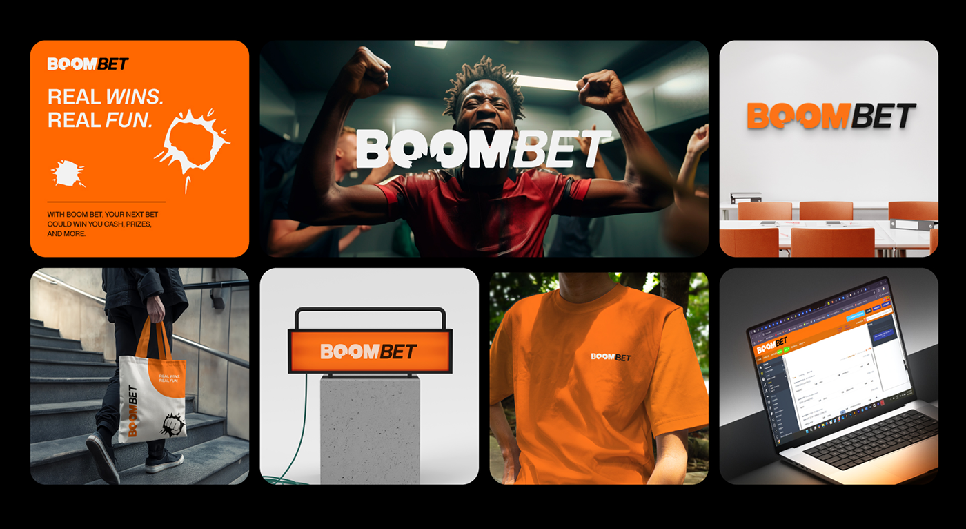
The identity system was rolled out across every brand touchpoint, including digital platforms, merchandise, signage, and promotional materials. Consistent use of vibrant colors, dynamic imagery, and confident layouts ensured that BoomBet’s personality was clear, cohesive, and memorable in both physical and digital spaces.
kefeta market
A local Ecommerce company
Branding
No next project

Samuel Bekele
Art Director
Working with Ha creative was a pleasure. His understanding of visual identity and detail is incredible — he brought our concept to life in a way that truly stands out.

Hanna Meles
Founder, GreenEarth Cleaning Services
Ha Studio designed a brand that perfectly reflects our eco-friendly values. The logo and colors speak to our mission beautifully I couldn’t be happier!

Dawit Tesfaye
Marketing Manager, EthioMart Online Store
From the first draft to the final delivery, Ha creative was professional, creative, and quick. Our new brand identity has already made a strong impact with customers.

Selamawit Getachew
CEO, Blue Events
I was amazed by how well Ha creative captured our vision. His designs are modern, elegant, and perfectly aligned with our audience.
Samuel Bekele
Art Director
Working with Ha creative was a pleasure. His understanding of visual identity and detail is incredible — he brought our concept to life in a way that truly stands out.
Hanna Meles
Founder, GreenEarth Cleaning Services
Ha Studio designed a brand that perfectly reflects our eco-friendly values. The logo and colors speak to our mission beautifully I couldn’t be happier!
Dawit Tesfaye
Marketing Manager, EthioMart Online Store
From the first draft to the final delivery, Ha creative was professional, creative, and quick. Our new brand identity has already made a strong impact with customers.
Selamawit Getachew
CEO, Blue Events
I was amazed by how well Ha creative captured our vision. His designs are modern, elegant, and perfectly aligned with our audience.