Project
OverView
Edemy came to us with a big ambition: to become the go-to platform for tech education and skills development, but their visual identity wasn’t keeping up.
The existing logo felt dated and failed to communicate the energy, clarity, and forward-thinking nature of the brand. It lacked scalability, versatility, and the ability to connect with today’s tech-savvy learners. On top of that, it didn’t adapt well across multiple touchpoints, from digital platforms to merchandise, leaving the brand feeling inconsistent and less impactful.
Edemy needed more than a logo refresh. They needed a complete visual overhaul — something bold, simple, and modern that could stand strong in the competitive tech learning space.
PROBLEMS
WE FACED
When we first stepped into Edemy’s brand world, we quickly identified several challenges holding them back from making the impact they deserved.
The old logo lacked modern appeal, failing to reflect innovation or professionalism. Its limited adaptability caused it to lose clarity across different formats, making consistent use difficult. Inconsistent visuals further weakened brand recognition and trust, while the design itself offered no emotional pull, failing to inspire or capture Edemy’s collaborative learning spirit.

OUR
SOLUTION
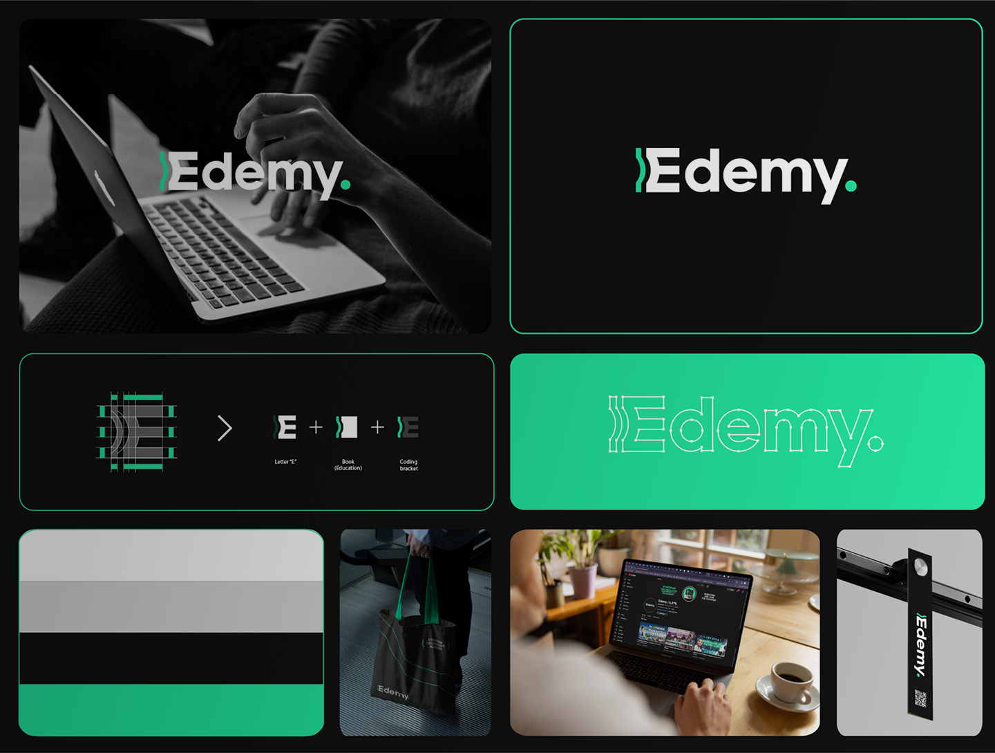
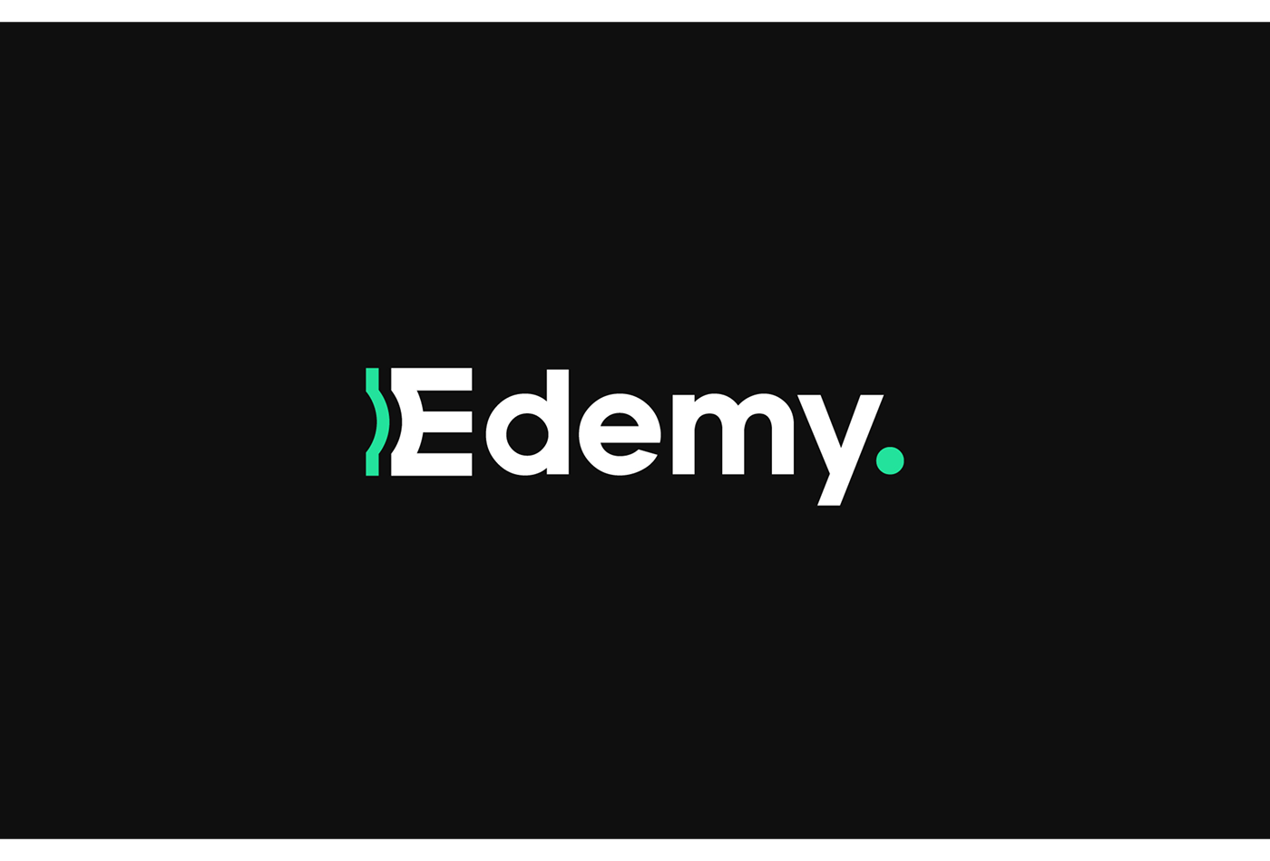
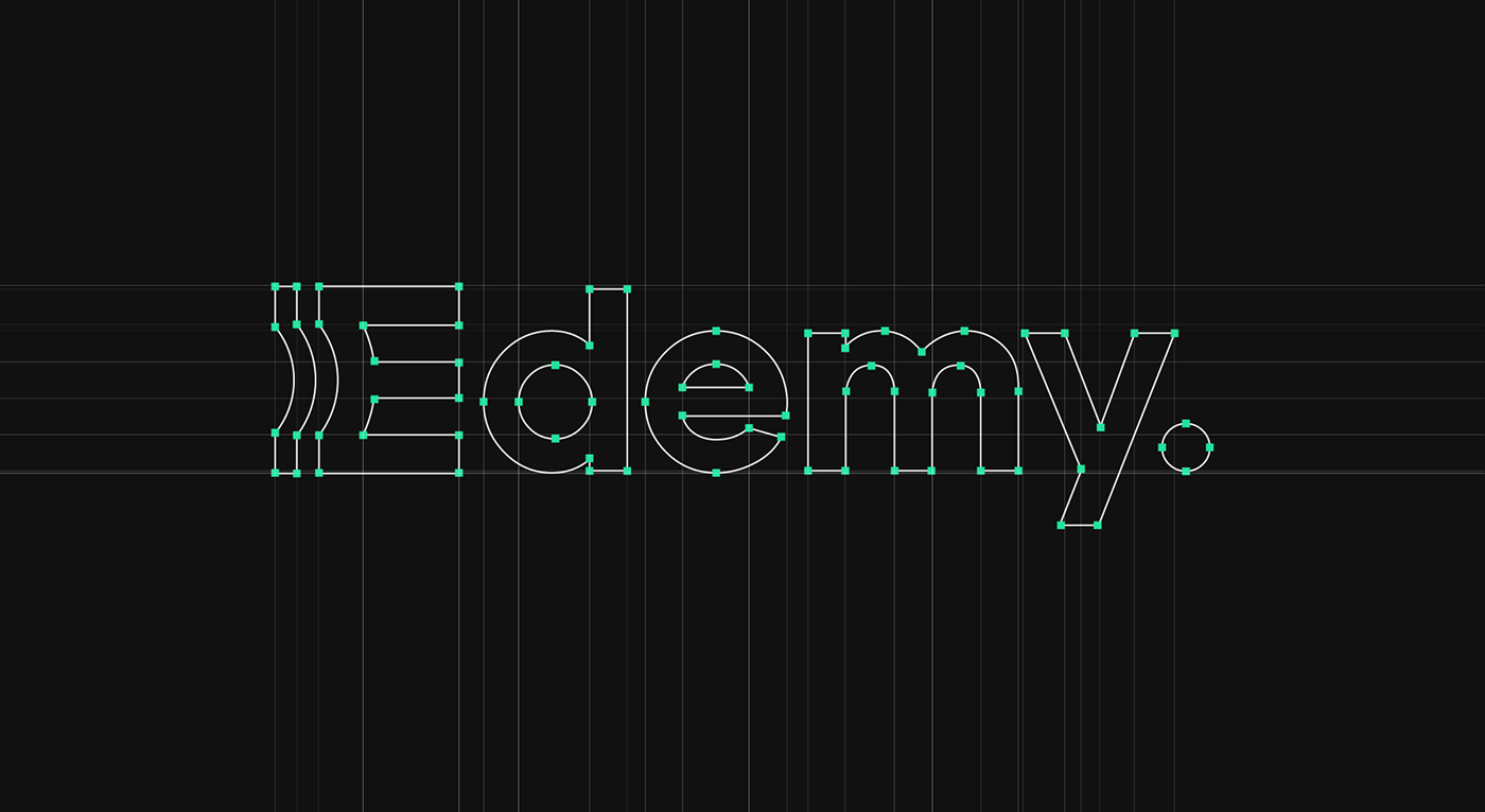
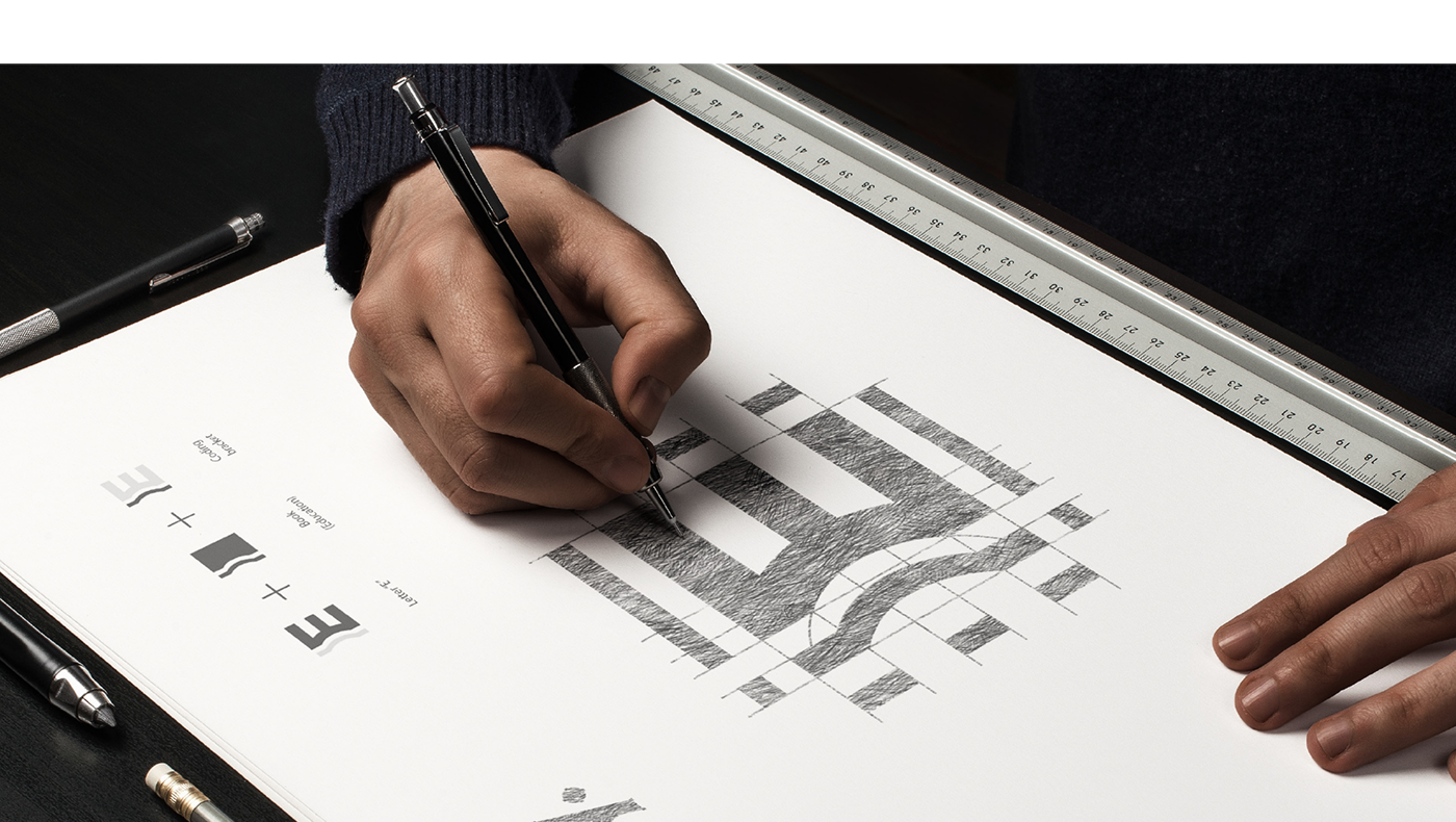
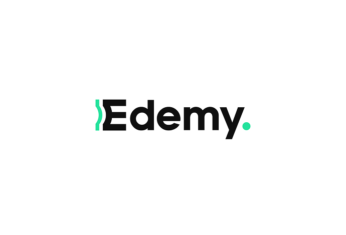
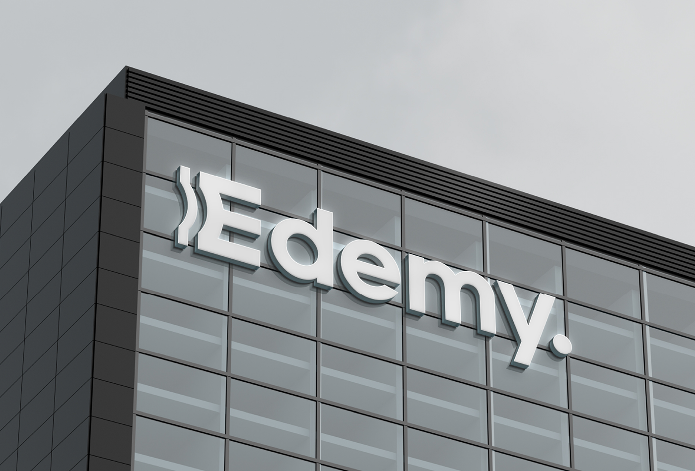
The new Edemy logo is clean, adaptable, and distinctive. The Bracketed “E” represents coding, technology, and structured learning.
Shape of a Book is embedded subtly within the form, nodding to education and growth. Typography is crisp and modern, with letterforms that are readable at any size, making the brand feel confident and approachable.
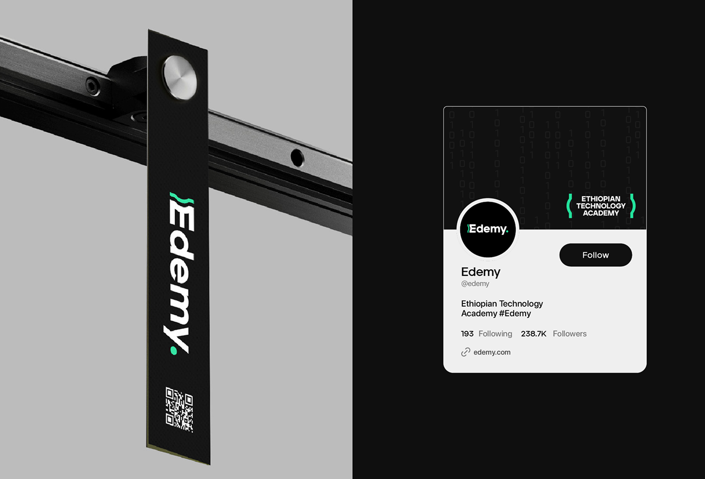
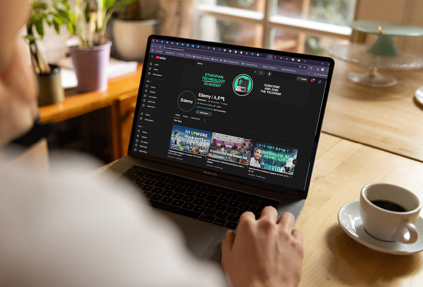
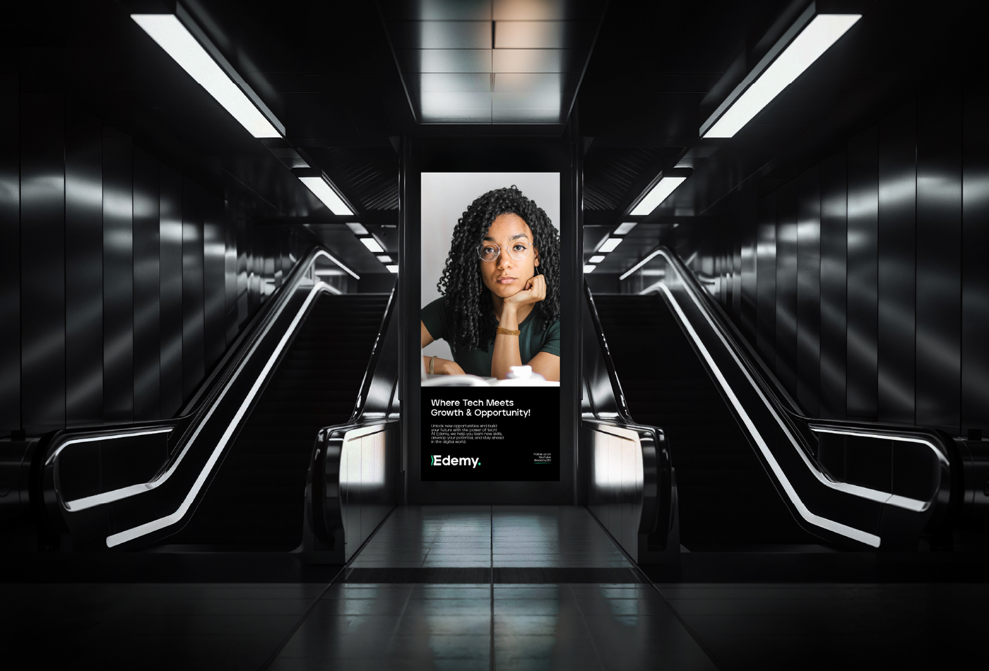
We extended this visual language into every touchpoint, from digital interfaces to event signage, from merchandise to environmental branding, creating a consistent and recognizable identity that could grow alongside the platform.
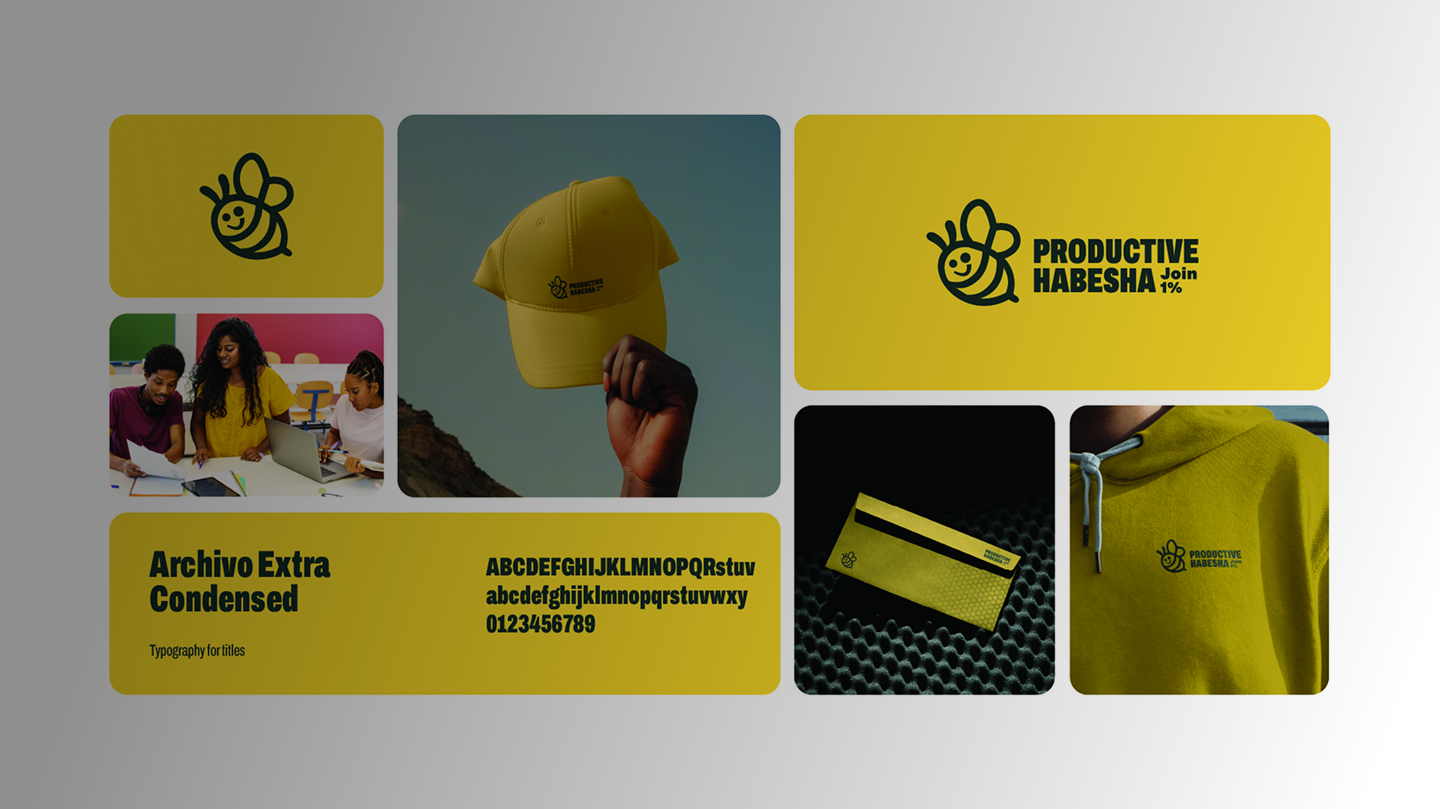
Productive Habesha
Self Development
Branding
KEFTA MARKET
A LOCAL ECOMMERCE COMPANY
Branding

Samuel Bekele
Art Director
Working with Ha creative was a pleasure. His understanding of visual identity and detail is incredible — he brought our concept to life in a way that truly stands out.

Hanna Meles
Founder, GreenEarth Cleaning Services
Ha Studio designed a brand that perfectly reflects our eco-friendly values. The logo and colors speak to our mission beautifully I couldn’t be happier!

Dawit Tesfaye
Marketing Manager, EthioMart Online Store
From the first draft to the final delivery, Ha creative was professional, creative, and quick. Our new brand identity has already made a strong impact with customers.

Selamawit Getachew
CEO, Blue Events
I was amazed by how well Ha creative captured our vision. His designs are modern, elegant, and perfectly aligned with our audience.
Samuel Bekele
Art Director
Working with Ha creative was a pleasure. His understanding of visual identity and detail is incredible — he brought our concept to life in a way that truly stands out.
Hanna Meles
Founder, GreenEarth Cleaning Services
Ha Studio designed a brand that perfectly reflects our eco-friendly values. The logo and colors speak to our mission beautifully I couldn’t be happier!
Dawit Tesfaye
Marketing Manager, EthioMart Online Store
From the first draft to the final delivery, Ha creative was professional, creative, and quick. Our new brand identity has already made a strong impact with customers.
Selamawit Getachew
CEO, Blue Events
I was amazed by how well Ha creative captured our vision. His designs are modern, elegant, and perfectly aligned with our audience.